Saturday 3 October 2009

Evaluation


http://www.mediaheaven.co.uk/digipak.htm
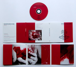
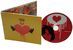
By looking through different examples of Digi-paks and finding information about them we found that each seemed to show a degree of a theme. They showed that colour schemes, images or logos were used on both the packaging and the CD itself, therefore we decided that we should follow this convention for our CD Cover and Magazine Advert. This led us onto trying different images, and themes for the Cover and then linking this into an Advert to show that they themselves are linked and one is promoting the other. We also used a focus group to gain audience feedback regarding the ideas that we had come up with, this audience feedback was very helpful regarding the simplicity that they thought these products should have. They helped us to realise that the Advert had to be eye-catching and interesting without confusing the reader about what it is actually about. This obviously led us onto the final arrow designs for both CD cover and Advert as we felt that they were interesting and eye-catching yet simple.

Before we started to produce our music video we each did research on the genre and type of video we were starting to think about. Through this research I feel we have integrated several of the conventions that we found into our own final product. For example, by watching previous videos by our chosen artist:
,

http://www.youtube.com/watch?v=WDQ2trtbSKA&feature=channel,

As well as more general artists:

We were able to see the recurring convention of including both performance footage and narrative footage in the same video. These videos helped me to familiarise myself with the conventions of this type of music video, like having narrative intercut with performance, having the singer have a role in the narrative, having the narrative include a couple in some kind of trouble etc. These conventions are especially apparent in the videos that I watched from Jimmy Eat World, they all seem to follow a very similar structure. They each have performance and narrative footage inter-cut, and more often than not the lead singer is also one of the characters in the story. This band also includes a small bit of footage before and sometimes after the video possibly to give the viewer/audience some of the context to the narrative that is included.
After researching music videos a brief treatment was written, this treatment helped us to order any specific events that we wanted in either the performance or the narrative side of the video. It also helped to highlight any major problems within the preliminary outline and allow us time to correct and change these issues before shooting. The main issue that the treatment highlighted was the amount of performance and narrative footage would work best for the track, eventually after re-drafting the treatment we arrived at having much less narrative intercut with the performance, but also including small introductory and ending shots that linked to the narrative.
When creating the CD ‘Digi-pak’ cover and Magazine advert for the Artist’s ‘Album’ again we researched these in order to highlight any similarities that were shown throughout the different examples.

Final Video

Print products


Both the CD Cover and the Magazine advert were made using Adobe Illustrator, and I chose to keep the lines fairly loose rather than having very clean cut line's as I felt that this overall look suited the Bands style and Music much more. I inverted the colour for the CD Cover in order to distinguish between the Advert and the Cover, however they are still linked through the use of the Coloured arrows and the illustrations of the Band.

editing

We have been editing the footage now for a good two weeks so forgive e for the lateness of this and the last post as we have been keeping busy :P. The editing is going very well, with a few minor problems, such as a few dropped frames here and there which, so far have not had any major problems related to them. Myself and Steve have both taken responsibility for the editing and are doing an even amount each, mainly with the other one of us supervising and influencing. We have not kept entirely to the animatic as this posed very difficult witht the footage we collected, although it was all good, it was not exactly what we were looking for so a certain amount of improvisationhas been nessesary.

The shoot

Overall the filming of the music video went very well, we got the majority of the work done across the two days mentioned in the last post and the footage is overall good. We had to shoot the band a hell of a lot of times so we can cut between the band members and create more pace and a more dynamic look. However there are a couple of other minor problems with it, the first being some of the footage that we filmed indoors did not have the best of lighting, so it was not the best quality i.e. it is quite grainy. Another problem we encountered was not having enough space in the office for the councilor part of the video, the office was quite cramped and fitting the jib in was a bit of a struggle, we also have a bit of a continuity error with this footage due to the way we filmed it, one minute the councilor is being looked at from one direction and looking back, next minute he is looking away from the others. to fix this problem we are re-shooting this entire section, hopefully within this week.

Shooting plan

It is coming close to the days we have chosen to shoot the footage. All shooting needed will hopefully be completed across two days, Wednesday and Thursday (1st and 2nd October). We have broken the shooting up into two sections, Narrative and Performance, the narrative shooting will take place on the Wednesday and the performance footage will be taken on the Thursday.
The brief schedule for Wednesday is: The shots of the counselling and counsellor first, House shots and the argument shots second, The street argument shots will be taken last and then if there is any time left after this any other shots that have presented themselves through the shooting will be taken.
The brief schedule for Thursday is: 1st run through of the song concentrate on the tight close ups of the instruments and band members, 2nd run through Close ups again with some mid-shots, 3rd run through will be the transition shots that we need and the longer shots and the final run through again will include a combination of the shots angles etc. any time left at the end will have more experimental angles and shots.

print development

We have been spending quite a lot of time working on getting the majority of the Advert and the Cover done so that I can finish the final designs whilst at home allowing both of us to concentrate on the filming that is coming up, we have now pretty much got a basic design that we feel is going to be simple yet exciting enough to get the audience interested in what it is. I am not going to show the whole thing because you will see it in the final design but they both include these:

CD covers


We have started to think about creating the CD Cover and Magazine advert and have started to produce early ideas for what we need to include. We have also been looking for real examples of Digi-paks or similar CD packaging to get a better idea of how they look and the conventions that they follow, for example:


In our preliminary discussions and plans we have decided that we do want some representation of the band on the Cover and the Advert. We have also decided to use illustrations rather than photos for both, this is because we felt that illustrations were a more interesting way to decorate and make them eye-catching.
We also want to keep them as simple as possible whilst not compromising on keeping them eye-catching.

illustrations of band members


We have come up with a simple design to represent the Artist on the CD Cover and the Magazine Advert. We had a discussion about the overall look of both of these and the main theme was that we wanted to keep it simple, so I sketched a simple figure using my laptop and graphics tablet :


Then working from this basic design we added a small amount of detail in order to distinguish between the separate members of the band:

Risk assessment


animatic


This is the animatic that we produced for our music video project.

Copyright


Due to the fact that the track we are using is a recognised song by a popular band there are issues with Copyright. Therefore we have written a letter to the Copyright holder (Interscope Records) in order to gain their permission for the use of the track "Let It Happen"

Research and Preparation

Obviously before we started the actual production of our music video we researched other music videos, both general and from the band we have chosen to produce a video for (Jimmy Eat World), what follows is some of the videos that we watched and how they shaped our own video idea:

here

This video is similar to the video we will be making, it has an element of performance and an element of narrative. The narrative follows the band through a day as they travel through Hong Kong. The performance uses quite bright colors and the narrative uses a more subdued color palate. The narrative doesn't really lead anywhere though but because it is a music video and it is very short it does not become boring to the audience, it has a very fresh style and is very modern compared to some videos. The clothes the band wear are quite formal and they look quite out of place, however this works within the context of the video.

here

This video also has narrative and performance included, once again the colour palette changes between the two. Whilst the footage is performance the colours are much more vibrant and they become much more subdued in the narrative footage probably to emphasize the emotional nature of the story. The fact that these two videos both have performance and narrative shows how popular this video set-up actually is and also led us onto this set-up for our video.

The next videos are two from "Jimmy Eat World" the first is from their latest album and the second is one of their older videos and songs:


These two videos are obviously very different, the first has no discernible narrative at all and focuses almost completely on the bands performance, whereas there is an obvious narrative in the second and whats more is the performance footage of the band is anchored within the setting of the story. The colour palettes in both these videos have also been tampered with, the first has an incredibly light palette with high lighting and fairly open backgrounds, but the second includes quite dark colours and has a much more confined setting. The fact that both of these videos and the majority of their other videos include footage of the band performing obviously made us develop our own idea into incorporating this to be inter-cut with the chosen narrative for the song (Let It Happen) changing our idea into the finalised and storyboarded plan.

Sunday 13 September 2009

Introduction

This blog is going to be a well documented diary of events regarding the production of a music video for an A level syllabus. There will be two contributors to both the music video production and hopefully this blog; they will be me (Steven Fischer) and Jacob Smith, we have worked together previously so to check out our testing of the new A level syllabus just copy and paste the following URL into your address bar (http://steve-and-jake-media.blogspot.com/)
If all goes to plan this blog will be updated regularly with what we are doing towards the music video and the decisions being made throughout the production, so make sure to keep checking back to see what's going on.